I just want to show another two plots for the statistical power of a test, since I didn't have time for this earlier
The code to produce them is just calling the methods of the power classes, for example for the one sample t-test.
I just want to show another two plots for the statistical power of a test, since I didn't have time for this earlier
The code to produce them is just calling the methods of the power classes, for example for the one sample t-test.


>>> print res.summary()
                                                        OLS Regression Results
==============================================================================
Dep. Variable:                      y   R-squared:                       0.901
Model:                            OLS   Adj. R-squared:                  0.898
Method:                 Least Squares   F-statistic:                     290.3
Date:                Thu, 10 May 2012   Prob (F-statistic):           5.31e-48
Time:                        13:15:22   Log-Likelihood:                -173.85
No. Observations:                 100   AIC:                             355.7
Df Residuals:                      96   BIC:                             366.1
Df Model:                           3
==============================================================================
                 coef    std err          t      P>|t|      [95.0% Conf. Int.]
------------------------------------------------------------------------------
x1             0.4872      0.024     20.076      0.000         0.439     0.535
x2             0.5408      0.045     12.067      0.000         0.452     0.630
x3             0.5136      0.030     16.943      0.000         0.453     0.574
const          4.6294      0.372     12.446      0.000         3.891     5.368
==============================================================================
Omnibus:                        0.945   Durbin-Watson:                   1.570
Prob(Omnibus):                  0.624   Jarque-Bera (JB):                1.031
Skew:                          -0.159   Prob(JB):                        0.597
Kurtosis:                       2.617   Cond. No.                         33.2
==============================================================================
The following three graphs are refactored versions of the regression plots. Each graph looks at the data and estimation results with respect to one of the three variables. (The graphs look better in original size.)
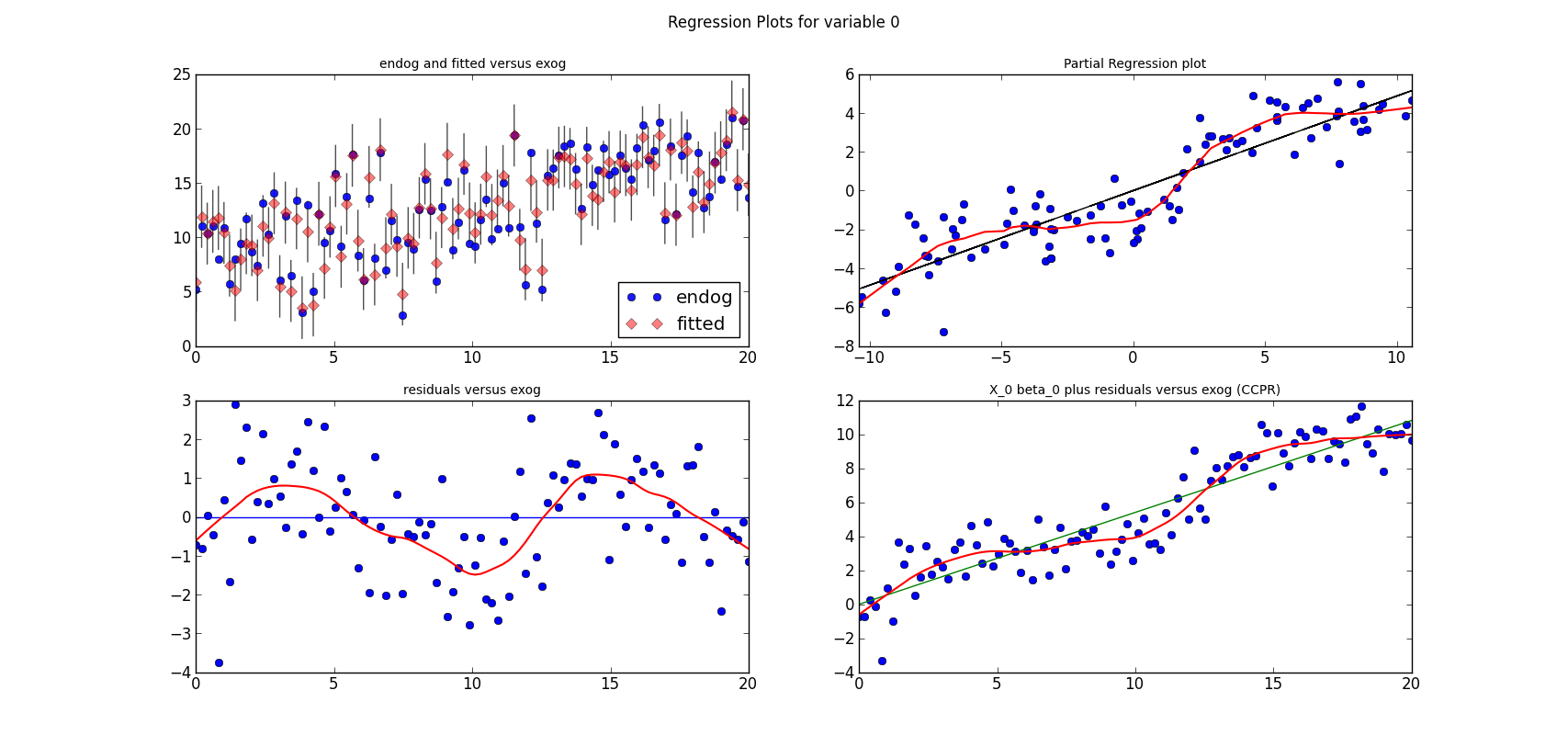
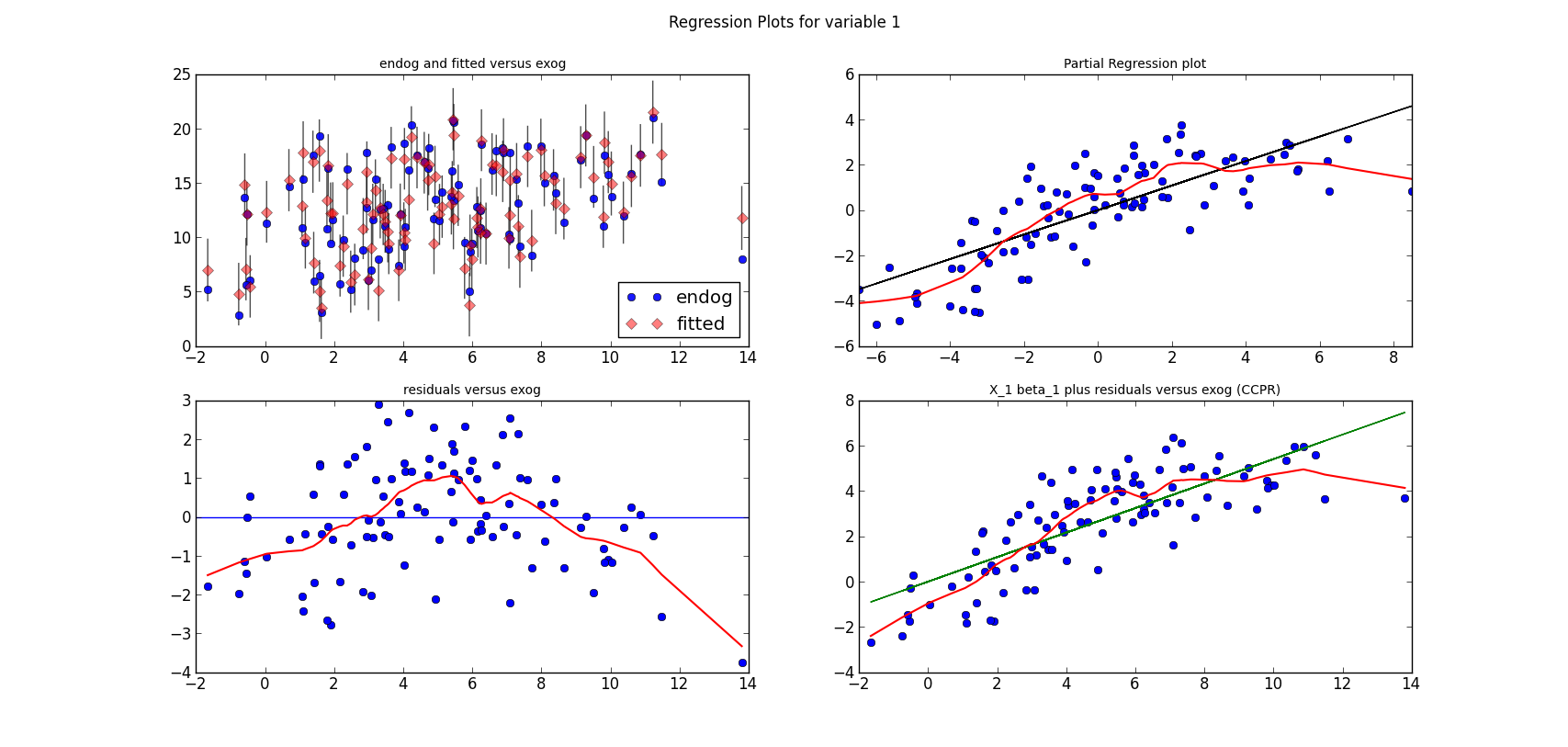
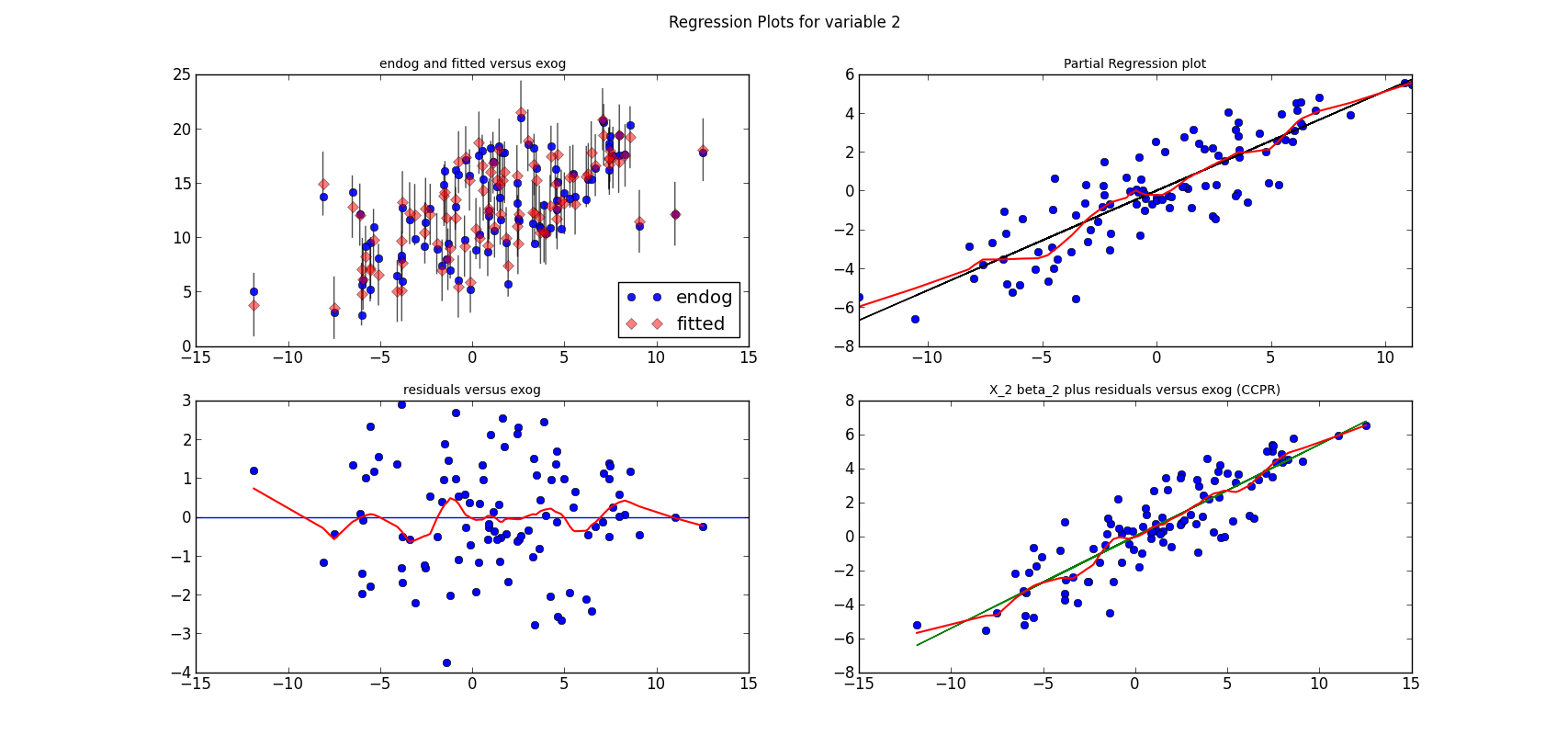
from regressionplots_new import plot_regress_exog

fig9 = plot_regress_exog(res, exog_idx=0)
add_lowess(fig9, ax_idx=1, lines_idx=0)
add_lowess(fig9, ax_idx=2, lines_idx=0)
add_lowess(fig9, ax_idx=3, lines_idx=0)

fig10 = plot_regress_exog(res, exog_idx=1)
add_lowess(fig10, ax_idx=1, lines_idx=0)
add_lowess(fig10, ax_idx=2, lines_idx=0)
add_lowess(fig10, ax_idx=3, lines_idx=0)

fig11 = plot_regress_exog(res, exog_idx=2)
add_lowess(fig11, ax_idx=1, lines_idx=0)
add_lowess(fig11, ax_idx=2, lines_idx=0)
add_lowess(fig11, ax_idx=3, lines_idx=0)
statsmodels has a graphics subdirectory, where we started to collect some of the common statistical plots. To make the documentation a bit more exciting, I am adding plots directly to the docstrings for the individual functions. Currently, we don't have many of them in the online documentation yet, two examples violin_plot and bean_plot.
qqplot(data, dist=stats.norm, distargs=(), a=0, loc=0, scale=1, fit=False, line=False, ax=None)I am not copying the entire docstring, what I would like to present here are some examples and how to work with the plots.
's' - standardized line, the expected order statistics are scaled
      by the standard deviation of the given sample and have the mean
      added to them
corresponds to the line after fitting location and scale for the normal distribution

- The first plot fits a normal distribution, keywords: line='45', fit=True
- The second plot fits the t distribution, keywords: dist=stats.t, line='45', fit=True
- The third plot is the same as the second plot, but I fit the t distribution myself, instead of having qqplot do it. keywords: dist=stats.t, distargs=(dof,), loc=loc, scale=scale, line='45'. I added the estimated parameters into a text insert in the plot. qqplot currently doesn't tell us what the fitted parameters are.

from scipy import stats
import statsmodels.api as sm

#estimate to get the residuals
data = sm.datasets.longley.load()
data.exog = sm.add_constant(data.exog)
mod_fit = sm.OLS(data.endog, data.exog).fit()
res = mod_fit.resid

fig = sm.graphics.qqplot(res, dist=stats.t, line='45', fit=True)
fig.show()
It works but the x-axis goes from -3 to 3, while there are only values from -2 to 2.
fig.axes[0].set_xlim(-2, 2)The resulting plot is then the same as the third plot in the first graph above.
from scipy import stats
from matplotlib import pyplot as plt
import statsmodels.api as sm

#example from docstring
data = sm.datasets.longley.load()
data.exog = sm.add_constant(data.exog)
mod_fit = sm.OLS(data.endog, data.exog).fit()
res = mod_fit.resid
Then I hardcode a left position for text inserts, and create a matplotlib figure instance
left = -1.8
fig = plt.figure()
Next we can add the first subplot. The only keyword arguments for qqplot is ax to tell qqplot to attach the plot to my first subplot. Since I want to insert a text to describe the keywords, I needed to spend some time with the matplotlib documentation. As we have a reference to the axis instance, it is easy to change or add plot elements
ax = fig.add_subplot(2, 2, 1)
sm.graphics.qqplot(res, ax=ax)
top = ax.get_ylim()[1] * 0.75
txt = ax.text(left, top, 'no keywords', verticalalignment='top')
txt.set_bbox(dict(facecolor='k', alpha=0.1))
The other subplots follow the same pattern. I didn't try to generalize or avoid hardcoding
ax = fig.add_subplot(2, 2, 2)
sm.graphics.qqplot(res, line='s', ax=ax)
top = ax.get_ylim()[1] * 0.75
txt = ax.text(left, top, "line='s'", verticalalignment='top')
txt.set_bbox(dict(facecolor='k', alpha=0.1))

ax = fig.add_subplot(2, 2, 3)
sm.graphics.qqplot(res, line='45', fit=True, ax=ax)
ax.set_xlim(-2, 2)
top = ax.get_ylim()[1] * 0.75
txt = ax.text(left, top, "line='45', \nfit=True", verticalalignment='top')
txt.set_bbox(dict(facecolor='k', alpha=0.1))

ax = fig.add_subplot(2, 2, 4)
sm.graphics.qqplot(res, dist=stats.t, line='45', fit=True, ax=ax)
ax.set_xlim(-2, 2)
top = ax.get_ylim()[1] * 0.75
txt = ax.text(left, top, "dist=stats.t, \nline='45', \nfit=True",
              verticalalignment='top')
txt.set_bbox(dict(facecolor='k', alpha=0.1))
The final step is to adjust the layout, so that axis labels don't overlap with other subplots if the graph is not very largefig.tight_layout()
import numpy as np
seed = np.random.randint(1000000)
print 'seed', seed
seed = 461970  #nice seed for nobs=1000
#seed = 571478  #nice seed for nobs=100
#seed = 247819  #for nobs=100, estimated t is essentially normal
np.random.seed(seed)
rvs = stats.t.rvs(4, size=1000)
The first two subplot are very similar to what is in the first graph
fig2 = plt.figure()
ax = fig2.add_subplot(2, 2, 1)
fig2 = sm.graphics.qqplot(rvs, dist=stats.norm, line='45', fit=True, ax=ax)
top = ax.get_ylim()[1] * 0.75
xlim = ax.get_xlim()
frac = 0.1
left = xlim[0] * (1-frac) + xlim[1] * frac
txt = ax.text(left, top, "normal", verticalalignment='top')
txt.set_bbox(dict(facecolor='k', alpha=0.1))

ax = fig2.add_subplot(2, 2, 2)
fig2 = sm.graphics.qqplot(rvs, dist=stats.t, line='45', fit=True, ax=ax)
top = ax.get_ylim()[1] * 0.75
xlim = ax.get_xlim()
frac = 0.1
left = xlim[0] * (1-frac) + xlim[1] * frac
txt = ax.text(left, top, "t", verticalalignment='top')
txt.set_bbox(dict(facecolor='k', alpha=0.1))
For the third plot, I estimate the parameters of the t-distribution to see whether I get the same results as in the second plot (I do), and so I can insert the parameter estimates into the plot
params = stats.t.fit(rvs)
dof, loc, scale = params
ax = fig2.add_subplot(2, 2, 4)
fig2 = sm.graphics.qqplot(rvs, dist=stats.t, distargs=(dof,), loc=loc,
                 scale=scale, line='45', fit=False, ax=ax)
top = ax.get_ylim()[1] * 0.75
xlim = ax.get_xlim()
frac = 0.1
left = xlim[0] * (1-frac) + xlim[1] * frac
txt = ax.text(left, top, "t \ndof=%3.2F \nloc=%3.2F, \nscale=%3.2F" % tuple(params),
              verticalalignment='top')
txt.set_bbox(dict(facecolor='k', alpha=0.1))
That's it for the plots, now I need to add them to the statsmodels documentation.>>> normal_ad(res) (0.43982328207860633, 0.25498161947268855) >>> lillifors(res) (0.17229856392873188, 0.2354638181341876)On the other hand, in the second example with 1000 observations from the t distribution, the assumption that the data comes from a normal distribution is clearly rejected
>>> normal_ad(rvs)
(6.5408483355136013, 4.7694160497092537e-16)
>>> lillifors(rvs)
(0.05919821253474411, 8.5872265678140885e-09)
PPS:
>>> from statsmodels.stats.adnorm import normal_ad
>>> from statsmodels.stats.lilliefors import lillifors


