I started to work on improving the documentation for the regressions plot in statsmodels. (However, I realized I have to improve them a bit.)
For now, just a question: Can you spot the mis-specification of the model?
I simulate a model, run a linear regression on three variables and a constant. Here is the estimation summary, which looks quite good, large R-squared, all variables significant, no obvious problems:
The short lines in the first subplot of each graph are the prediction confidence intervals for each observation.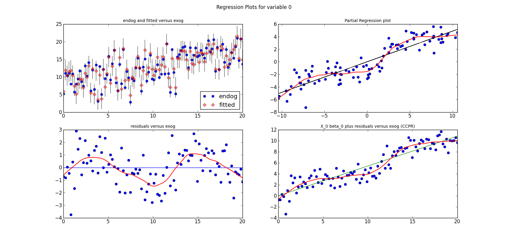
The code is short, if we have the (still unpublished) helper functions.
res is an OLS results instance
For now, just a question: Can you spot the mis-specification of the model?
I simulate a model, run a linear regression on three variables and a constant. Here is the estimation summary, which looks quite good, large R-squared, all variables significant, no obvious problems:
>>> print res.summary()
                                                        OLS Regression Results
==============================================================================
Dep. Variable:                      y   R-squared:                       0.901
Model:                            OLS   Adj. R-squared:                  0.898
Method:                 Least Squares   F-statistic:                     290.3
Date:                Thu, 10 May 2012   Prob (F-statistic):           5.31e-48
Time:                        13:15:22   Log-Likelihood:                -173.85
No. Observations:                 100   AIC:                             355.7
Df Residuals:                      96   BIC:                             366.1
Df Model:                           3
==============================================================================
                 coef    std err          t      P>|t|      [95.0% Conf. Int.]
------------------------------------------------------------------------------
x1             0.4872      0.024     20.076      0.000         0.439     0.535
x2             0.5408      0.045     12.067      0.000         0.452     0.630
x3             0.5136      0.030     16.943      0.000         0.453     0.574
const          4.6294      0.372     12.446      0.000         3.891     5.368
==============================================================================
Omnibus:                        0.945   Durbin-Watson:                   1.570
Prob(Omnibus):                  0.624   Jarque-Bera (JB):                1.031
Skew:                          -0.159   Prob(JB):                        0.597
Kurtosis:                       2.617   Cond. No.                         33.2
==============================================================================
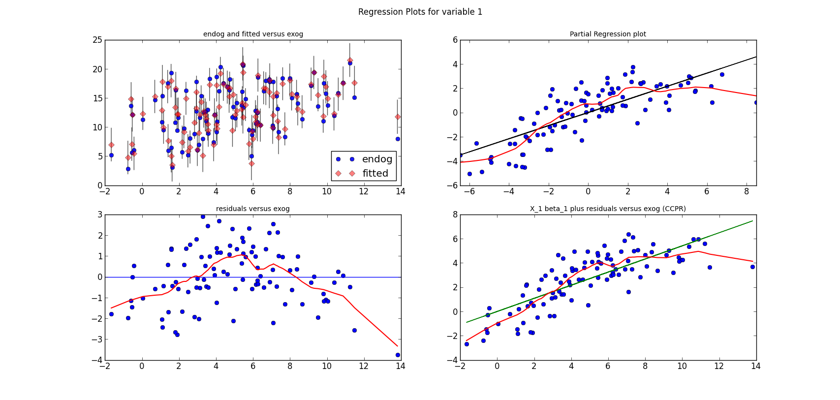
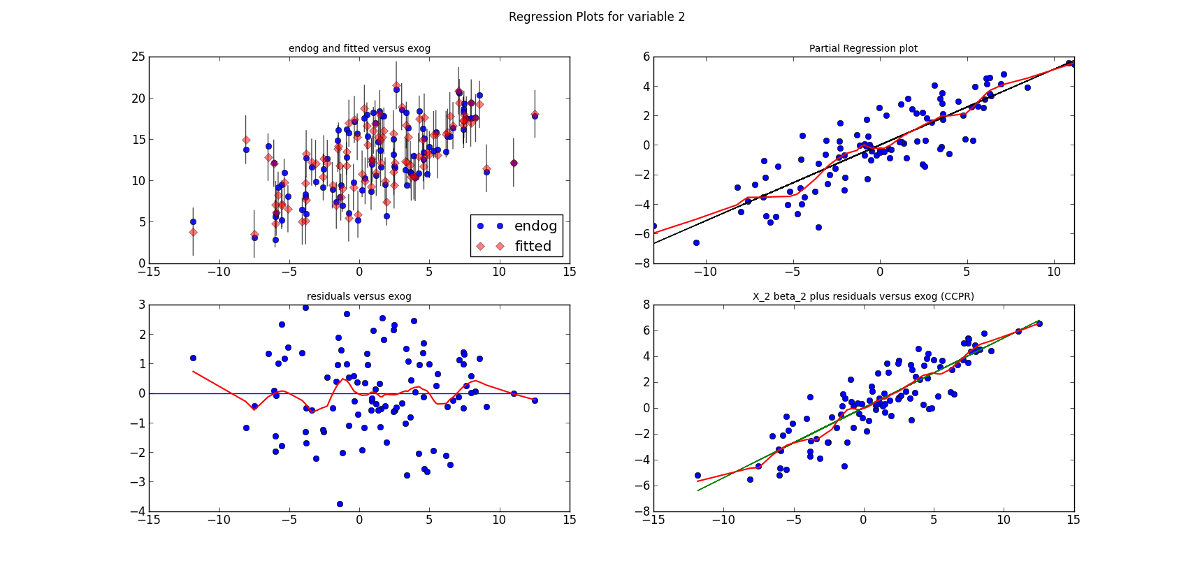
The following three graphs are refactored versions of the regression plots. Each graph looks at the data and estimation results with respect to one of the three variables. (The graphs look better in original size.)
The short lines in the first subplot of each graph are the prediction confidence intervals for each observation.
The code is short, if we have the (still unpublished) helper functions.
res is an OLS results instance
from regressionplots_new import plot_regress_exog

fig9 = plot_regress_exog(res, exog_idx=0)
add_lowess(fig9, ax_idx=1, lines_idx=0)
add_lowess(fig9, ax_idx=2, lines_idx=0)
add_lowess(fig9, ax_idx=3, lines_idx=0)

fig10 = plot_regress_exog(res, exog_idx=1)
add_lowess(fig10, ax_idx=1, lines_idx=0)
add_lowess(fig10, ax_idx=2, lines_idx=0)
add_lowess(fig10, ax_idx=3, lines_idx=0)

fig11 = plot_regress_exog(res, exog_idx=2)
add_lowess(fig11, ax_idx=1, lines_idx=0)
add_lowess(fig11, ax_idx=2, lines_idx=0)
add_lowess(fig11, ax_idx=3, lines_idx=0)

